
What is Colour Theory
The term colour theory is used to describe a collection of rules and guideline that regard towards colour use in art and design and also media. This theory is meant to inform the design use of the colour schemes, which aims at aesthetic appeal and effective communication through the levels of design, both visually and psychologically.
Colour Wheel Theory
The modern day use of colour theory is mainly based from Isaac Newton’s colour wheel. Sir Isaac Newton (born on January 4th 1643 at Lincolnshire, England – died March 31st 1727, London) was well known for as an English Physicist and Mathematician, who became a culminating figure of the scientific revolution of the 17th Century. He discovered the composition of the white light that integrated the phenomena of colours into the science of light, which led him to the foundation for modern physical optics. The colour wheel is a basic tool to visually analyse and discuss the principles of colour. There are many other variations of the it throughout each generation till the modern day, but still follows the similar principles that were originally created by Newton himself. The wheel contains all colours of the spectrum and which it also presents them in the correct sequence. For example, by adding purple from a mixture of red and blue, the colours can be placed in a form of a circle.

Robert. C. Tom.P (1990). The Colour Eye. pp.12
This version of the colour wheel was one devised by Johannes Itten during in the middle of the century. He purposely created this version of the because this diagram was easily remembered with its 12 hues that were clearly visualised, which would result in enabling the intermediate hues to be located in a quick fashion. This helps provide a more ordered and objective basis for colour pigments or paints. The triangle featured in the centre of the wheel contain the 3 primary colours, yellow, blue and red. These are called primaries because these colours cannot be created by a mixture from other pigments. On each side of the triangle, there are 3 more flat shaped triangles that each present secondary colours, which have been produced from mixed primary colours according to Itten’s scheme. Few examples such as yellow and blue produce green; red and yellow produces orange; blue and red produces violet. What surrounds these triangles is the colour wheel itself, which contains 12 decided sectors of colour. 6 of them are both filled with primaries and secondaries, there is also another colour that has been placed between them. Itten has expressed these tertiary colours, this type of colour have been obtained by the mixture from both primary and secondary. For example, red and orange produces red-orange, the mixture list goes on. It is possible to further create subdivisions, but Itten considered it to be pointless.
While learning upon this research, I found it to be useful on facts about colour and how to use them correctly. The colour wheel could bring in a variation of opportunities for me to chooses from. Which colours would appeal more to my interests and how I could use them to get the results I want for my project. By reflecting off this I could try picking or mixing primary and secondary colours for a convincing visual tone.
Colours have another combination method to form up 1 of 5 main colour schemes in which allows designers to create harmony to their work.
Analogous Colours

(Arizona, 2019)
Analogous is a base set of 3 colours located next each other on the colour wheel.
Complimentary Colours

Complimentary is one or more pair of colours that are opposite from each other on the wheel. When combining these colours, it will result in producing more vibrant colours.
Split-complementary
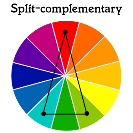
Split-complementary is a combination form of both analogous and complementary schemes. By picking 1 or 2 main colours, it can result in a paint scheme with high contrast without the tension of the complementary scheme.
Triadic

Triadic is where 3 colour uses an equal distance from each other on the wheel. This scheme is known to produce powerful visual contrast, while retaining a richness of colour and balance. It may not be as contrasting as the complementary scheme, but it is more balanced and harmonious.
Double Contrast

Double contrast scheme is based on complimentary colours, but in an advanced way by choosing a dominant colours both complimenting and picking to the designers main right colours of the colour wheel. This can result in producing bold and retro based colours for its paint scheme
I found all 5 methods to be interesting because I want colour to visually tell the story to my audience. Harmonising colours will be very important to help me decide on the overall colour pallet for the visual cinematography. Analogous looks to be the most convincing choice for me to use for my project.
Mixing coloured lights together will not produce the same results as mixed pigments. When mixing coloured lights together, it will result in the colours corresponding to each other to combine the wavelengths of the light when mixed. Pigments do the opposite by absorbing light wavelengths. Itten’s had a viewpoint interest of colour through scientific and spiritual methods. He taught students about it at the Baushaus School in Germany around 1920s through elements of the bauhaus course, which actually included the colour wheel. It has now become the standard principle of art across the world.
Language of Colour

Robert. C. Tom.P (1990). The Colour Eye. pp.15
Hue
Hue is another phrase meaning for pure spectrum of colour which are commonly referred to the colour names. Panically a certain blue colour tone is specifically a hue. On this diagram, there are 12 variations of hue, from dark blue on the 4th left column to purple on the right. Estimations show that normal visions can differ an approximate total of 10 million hue variations.
Saturation
Saturation is method language that describes the purity of a specific hue, such as its colourfulness, chroma, intensity and weight. For example based on the graph above, the yellow on the third line is at its full saturation.
Tone
The main description for tone is lightness, value, brilliance, greyness and luminosity. This is when a hue progressively becomes more diluted with white to a darkened black tone of that specific colour.
This could be reflected onto my work by picking variations of a specific colour for the project’s visuals. Saturation will be helpful for me decide on how colourful and intense I want the image to look. Tone will be a good balancing tone for lighting and shadows for colours and the image as a whole.
Reflection Towards my FMP
Overall, I found all this contextual research on colour theories to be useful. It made me understand the uses of colour more for image based project. It will be useful for my design methods which hopefully will be psychologically intriguing for my audience. I will reflect back on these elements and use them towards the main idea and production process of my Final Major Project.
Harvard Reference Sites
https://www.britannica.com/biography/Isaac-Newton
https://www.interaction-design.org/literature/topics/color-theory
Char.txa.cornell.edu. (2019). Color, Value and Hue. [online] Available at: http://char.txa.cornell.edu/language/element/color/color.htm [Accessed 15 Mar. 2019].
Image References
Arizona, C. (2019). Analogous Paint Color Wheel & Example Uses with Pictures. [online] CBP. Available at: https://www.cbpofarizonainc.com/analogous-paint-schemes/ [Accessed 15 Mar. 2019].
CBP. (2019). Interior & Exterior Paint Schemes | 6 Best Color Wheel Examples. [online] Available at: https://www.cbpofarizonainc.com/paint-schemes/ [Accessed 15 Mar. 2019].
Bibliography
Robert. C. Tom.P (1990). The Colour Eye. BBC Enterprises Limited: London, pp. 12, 15.

Leave a comment